312-439-5143


Business Cards
DebtBlue Brand Cards
Logo-only first, mission statement second, recognition before the pitch. Deep navy with a soft radial glow reads institutional and calm, which matters for a debt relief brand whose audience often arrives anxious. The wordmark itself argues the value prop: an italic, leaning "Debt" (momentum, moving forward) fused to a solid "Blue" (stability, staying power). The mission copy is stacked as short centered lines rather than a paragraph, so it reads as a cadence, fight, negotiate, advocate, deliver peace of mind, not a wall of text.

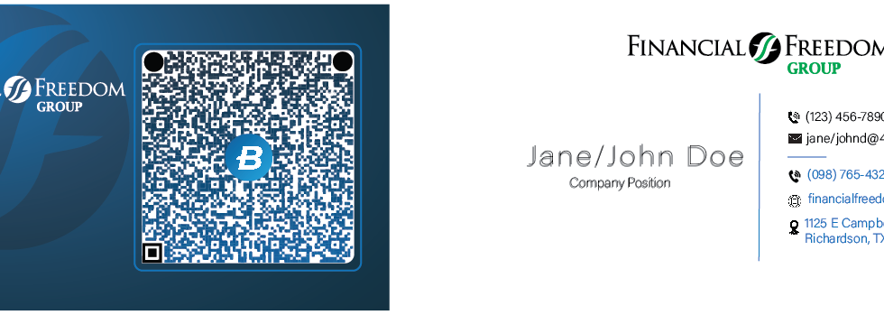
Financial Freedom Business Card
Two-sided layout - Front is pure brand (logo, gradient, QR code); back is a clean contact directory. Keeps each side focused instead of cluttered.
Front design - The navy gradient and oversized watermark swoosh add depth without competing with the logo, and dark blue reads as trustworthy for a financial brand. The QR sits in a bordered container with the logo icon on top, tying it visually to the wordmark instead of looking like a generic code.
Back hierarchy - Right-aligned text against a vertical rule guides the eye in one line. "Jane/John Doe" and "Company Position" are greyed out as placeholders, showing this is a reusable template. Icon-led contact rows (phone, email, web, pin) make it scannable in seconds.
One note for the write-up: the QR is intentionally dead since it's on public display - it's a V-card that would normally link straight to the phone contact info.
DebtBlue Brand Card / Mission Statement
Logo-only first, mission statement second, recognition before the pitch. Deep navy with a soft radial glow reads institutional and calm, which matters for a debt relief brand whose audience often arrives anxious. The wordmark itself argues the value prop: an italic, leaning "Debt" (momentum, moving forward) fused to a solid "Blue" (stability, staying power). The mission copy is stacked as short centered lines rather than a paragraph, so it reads as a cadence, fight, negotiate, advocate, deliver peace of mind, not a wall of text.

Posters Advertising and Screens
Company Poster
When taking this on I saw that this schedule has a harder job than most flyers: it's a minute-by-minute timeline with hard cutoffs people will be held to, so it has to be scannable one-handed, in bad lighting, at a party. Timestamps are bolder and a different color than their descriptions, so someone can scan just the times without reading full sentences.
The casino iconography (dice, cards, chips, a horseshoe) doubles as wayfinding, a die by the opening remarks, a chip by the raffle line, breaking up what would otherwise be a dense block of rules. The card-suit border gives it a keepsake feel, since people are more likely to photograph this than carry it. The strict, near-all-caps rules (no exceptions, must be present) are the least "designed" moment on the page on purpose, with a $2,500 prize on the line, clarity beats elegance in this case.

Company Merger Announcement
When taking this on I saw that this schedule has a harder job than most flyers: it's a minute-by-minute timeline with hard cutoffs people will be held to, so it has to be scannable one-handed, in bad lighting, at a party. Timestamps are bolder and a different color than their descriptions, so someone can scan just the times without reading full sentences.
The casino iconography (dice, cards, chips, a horseshoe) doubles as wayfinding, a die by the opening remarks, a chip by the raffle line, breaking up what would otherwise be a dense block of rules. The card-suit border gives it a keepsake feel, since people are more likely to photograph this than carry it. The strict, near-all-caps rules (no exceptions, must be present) are the least "designed" moment on the page on purpose, with a $2,500 prize on the line, clarity beats elegance in this case.

Lobby Advertising
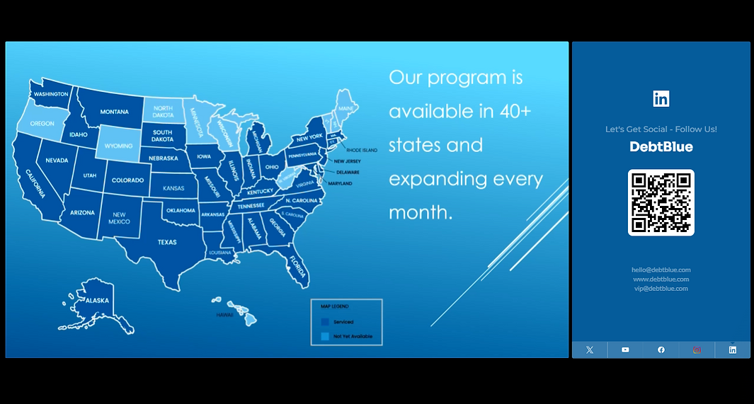
This is a two-panel screen built for a loop, not a single read — it needs to work whether someone glances at it for two seconds or watches the full rotation. The left panel carries the actual news (state-by-state coverage, 40+ states and growing) using a filled-map format instead of a bar chart or list, because for a "we operate here" claim, the shape of the country doing the talking is more immediately convincing than any number would be — the eye registers "most of the map is dark blue" before it even reads the word forty.
The right panel is a fixed anchor rather than something that changes with the rotation — QR code, handles, and contact info stay put across the whole loop so a viewer glancing up mid-cycle always has a way to act, not just a moment of "wait, what was that." Putting the social follow prompt on a permanent screen rather than a one-off slide reflects a pretty simple insight: a QR code only works if it's on screen long enough to actually scan, so it doesn't compete for attention with content that's cycling out from under it.
Websight Design
DebtBlue Core Values (Internal Site Page)
Ghosted wordmark in the banner keeps branding present without competing with the "Core Values" label up front. Mission and Vision get their own bands before Values appears, since the values only make sense once people know what they're in service of, and the image/text sides alternate to break up the rhythm. Values itself drops into a plain, calm background for the densest content on the page: one word, one plainspoken instruction each ("Play the next play," "Especially when no one is watching") rather than paragraphs, since a value that needs three sentences of explanation doesn't survive being quoted back in a meeting.
